Mobile & PWA
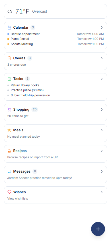
Prism is built as a Progressive Web App (PWA) that adapts to whatever you install it on: phone, tablet, kiosk, or wall-mounted display. Same code, same data, different UI surface depending on screen size, orientation, and pointer type.
Installation
iOS (Safari)
- Open Prism in Safari.
- Tap the Share button.
- Select Add to Home Screen.
- Tap Add.
The app opens without browser chrome (no URL bar, no Safari toolbar). Standard iOS PWA: supports notification badges, theme color, splash screen.
Android (Chrome / Edge)
- Open Prism in Chrome.
- Tap Menu (three dots) → Install app (or Add to Home Screen on older versions).
- Confirm.
App launches standalone, full screen.
Desktop (Chrome / Edge / Brave)
- Open Prism in the browser.
- Click the install icon in the address bar (the small
+or computer icon). - The app opens in its own window without browser chrome.
Useful for a dedicated dashboard machine: pin to taskbar, set to launch on startup.
App icon shortcuts (Android + desktop Chromium)
Long-press the app icon (or right-click on desktop) for quick-jump shortcuts:
- Shopping
- Tasks
- Messages
Custom shortcuts can be added by editing public/manifest.json.
Service worker + offline support
The service worker (public/sw.js) precaches static assets:
- App shell (the
_nextstatic assets: CSS, JS chunks) is precached on install. - The start URL (
/) is served network-first, falling back to the cached copy when offline.
That's the extent of it. There is no API-response caching, no offline mutation queue, and no background-sync retry. Prism is not an offline-first app. If the device is offline, expect to refresh manually once you're back online, and don't expect changes made while offline to be captured.
Navigation by surface
Prism uses three different nav components depending on screen size + orientation:
| Layout | Component | When |
|---|---|---|
| SideNav | Collapsible left sidebar | Landscape desktop / large tablet. Default for most kiosks. |
| PortraitNav | Bottom drawer + sliding panel | Portrait tablets. Bottom bar with drawer that slides up for more pages. |
| MobileNav (FAB) | Floating action button | Phone viewports. Replaces bottom nav with a single floating button. |
The AppShell component picks the right nav based on the active viewport + orientation. Switching orientation triggers a re-evaluation.
FAB (phone PWA)
The Floating Action Button is a single circular button in the bottom corner. Tap it to expand a small menu. Which actions appear depends on the current page:
Always available:
- Home: back to dashboard.
- Settings: opens the full Settings page.
- Login / Logout: switch users (shows Login when logged out).
On the dashboard only:
- Reorder: drag cards on the dashboard into your preferred order.
- Cards: show/hide dashboard cards (plus layout + theme controls, see below).
On the Shopping page only:
- Scan Barcode: scan an item into the active list.
Designed to use minimum screen space and stay out of the way during regular use.
Card reorder mode
In FAB → Reorder, dashboard cards become draggable with grip pills on each one. Drag to reorder, tap Done to save. Persists per user.
FAB → Cards
FAB → Cards shows a toggle for each available card. Turn off cards you don't use (e.g. Bus Tracker if you don't have one). Hidden cards don't render at all. Saves render cycles on a phone.
The same panel also carries two extra controls:
- Layout: switch the mobile dashboard between Rows and Tiles.
- Theme: cycle Light / Dark / Auto.
Mobile dashboard
On phones, the full dashboard grid collapses into a single-column summary card layout:
- Weather card: current temp + conditions + a small forecast strip.
- Calendar card: agenda-only, next 5 events.
- Tasks card: top 5 incomplete tasks.
- Shopping card: top 5 active list items.
- Chores card: pending chores for everyone.
- Meals card: today's planned meals.
- Messages card: last 3 messages.
- Birthdays card: upcoming birthdays.
These eight are the defaults. Clock, Bus Tracker, Recipes, Goals, Wishes, and Photos are also available and can be turned on via FAB → Cards.
Tap any card to navigate to the full page for that feature. The cards are reorderable + can be individually hidden via the FAB controls.
Calendar on mobile
The calendar collapses to agenda view only on phone viewports:
- View switcher hidden.
- Day/Week chevron navigation hidden (no-op for agenda anyway).
- Today button hidden.
- Header reads "Upcoming Events" instead of the date.
useEffectforces agenda mode on mobile regardless of what was last selected on desktop.
Why: the multi-week + month + schedule grid views don't fit comfortably on a phone, and on the go what you actually want is the agenda.
Touch targets + interactions
All interactive elements meet or exceed the 44px touch target minimum (Apple HIG standard, also Material Design's recommendation). Buttons, list rows, checkboxes, drag handles: everything is sized to be tappable without precision.
Common gestures:
- Tap: primary action. Shopping items toggle, calendar cards open, dashboard cards navigate.
- Long-press: secondary actions (edit, delete, drag). Some lists also use long-press for drag activation so vertical scrolling stays the default.
- Swipe left/right: navigate calendar periods. 50px threshold so accidental swipes during scroll don't trigger.
Responsive font sizes
Font scale adapts to the device class:
html { font-size: 16px; }                                        /* phone default */
@media (pointer: fine)                       { font-size: 14px; }  /* desktop mouse */
@media (min-width: 768px)  and (pointer: coarse) { font-size: 18px; }  /* tablet touch */
@media (min-width: 1024px) and (pointer: coarse) { font-size: 20px; }  /* large tablet */
@media (min-width: 1400px) and (pointer: coarse) { font-size: 22px; }  /* kiosk */
The pointer: fine vs pointer: coarse media query distinguishes mouse-controlled (desktop laptop) from touch (tablet kiosk) at the same screen size. Same physical 13" display gets 14px on a laptop (mouse) but 20px on a tablet (touch).
Override globally via Settings → Appearance → Font Scale (planned, not yet shipped as of v1.8).
Orientation detection
The useOrientation hook listens to resize + orientationchange events and returns the current orientation. The AppShell re-evaluates nav choice on every orientation change.
Set an orientation in Settings → Appearance → Orientation Override (Landscape / Portrait / Auto). Note this override only drives photo and wallpaper orientation matching. It does not change which navigation or layout is shown. The nav still follows the physically detected orientation (width vs height).
Screensaver + Away mode behavior on PWA
PWA installations auto-disable screensaver and Away mode. Rationale:
- Phone PWAs don't have idle states the way kiosks do. Your phone is either in your pocket or actively in use.
- Auto-activating Away mode on a phone would lock the family member out of their own device.
- Screensaver photo slideshow on a phone screen is wasted battery.
The useIsPWA hook detects standalone display mode and short-circuits both.
If you specifically want the screensaver on a phone (rare, maybe a kid's bedside iPad), turn off PWA mode by opening Prism in the browser instead of the installed app.
Notification badges (planned)
iOS 16+ and Android Chrome support PWA notification badges (the little number next to the icon). Prism doesn't currently set badge counts, but the infrastructure is in place, tracked as a follow-up to surface unapproved chores or unread messages.
Common workflows
Phone in pocket, occasional checks
Install as PWA on the phone. Default opens to dashboard summary cards. Tap a card to dive into the full feature. Use the FAB to switch users when needed.
Tablet permanently mounted in the kitchen
Don't install as PWA. Open in fullscreen Chrome or use kiosk mode. SideNav stays visible, no nav restrictions, dashboard grid + Calendar + Shopping all accessible. Set orientation override to whatever the mount uses.
Phone in shopping mode at the grocery store
Install as PWA. Open Shopping. Hit the maximize icon (top right) to enter shopping mode: full screen, no nav, tap items to strike through. Camera icon in the header to scan barcodes.
Spouse uses iOS, you use Android
Both install as PWA on their own devices. Different shopping mode preferences, different filter presets, but the same data, the same family. PIN-based login means switching users on a shared device (e.g. the kitchen tablet) is a tap + a per-member PIN (4 or 6 digits).
Troubleshooting
"Install" prompt missing
PWA install criteria: served over HTTPS, valid manifest, valid service worker, not already installed. If the install prompt doesn't appear in Chrome, check the address bar for the install icon (small +), or DevTools → Application → Manifest for errors.
iOS Safari doesn't show a "Install" prompt at all. Install is always via Share → Add to Home Screen.
Updates not showing after a deploy
The service worker caches aggressively. After a deploy:
- Force-refresh: hard reload (Ctrl+Shift+R on desktop, pull down + hold in Chrome on mobile).
- Or: uninstall the PWA, reinstall.
- Or: DevTools → Application → Service Workers → Update / Unregister.
The service worker is configured to skip-waiting on new versions, so reloads usually pick up the update within seconds. But sometimes a cached page sticks.
Bottom nav covers content
Mobile pages have extra bottom padding to clear the nav bar. If you see overlap, file an issue with the specific page: almost always a missing pb-20 (or equivalent) on a recently-added page.
Calendar showing month view on phone (not agenda)
The agenda-only restriction was added in v1.8. If you're seeing month view on your phone, you're on an older client build. Hard-refresh.
FAB missing
FAB only shows on phone viewports (max-width: 767px). On tablets you should see PortraitNav (bottom drawer) instead. The FAB is present on phone viewports whether or not anyone is logged in. When logged out it simply offers a Login action.
Cards in mobile dashboard appearing in wrong order
Did you customize the order in FAB → Reorder? It persists per user. Switching users will load that user's saved order. Tap FAB → Reorder → drag → Done to reset.
Service worker registration fails
Usually a service-worker file path issue. Check DevTools → Console for Failed to register a ServiceWorker errors. The public/sw.js must be served from the root scope (/sw.js). If you've moved it, the registration in the app entrypoint needs updating.